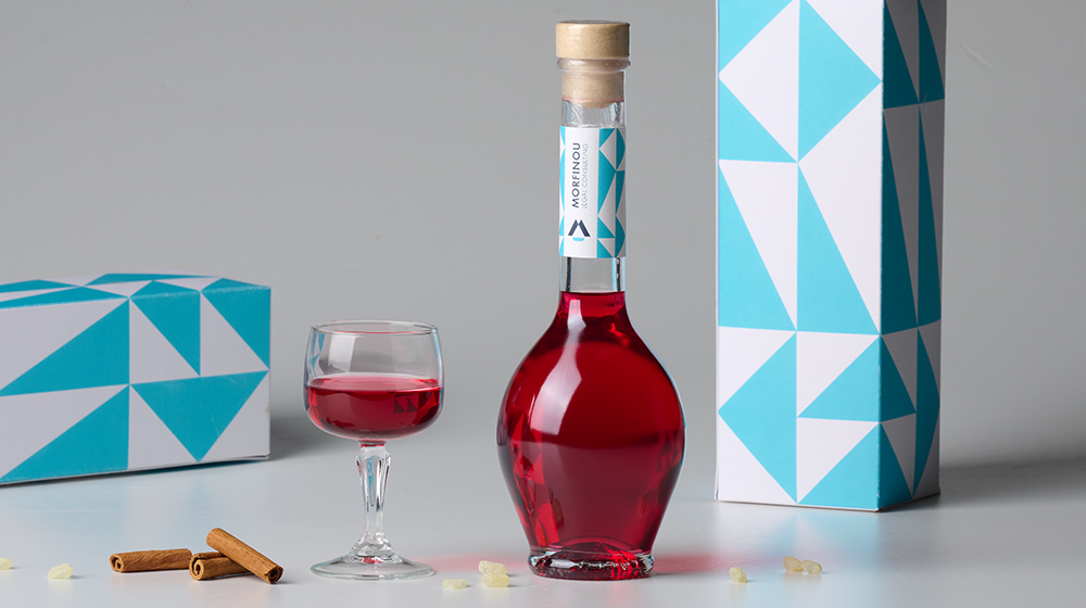
- Liqueur
Packaging refers to a broad range of actions to develop a package design and generate an acceptable and appealing container or wrapping for a product. We created the "Open Sails" concept as the product name and depicted the sails so as to resemble the characteristic patterns that can be seen in Chios island - the origin of this liqueur.
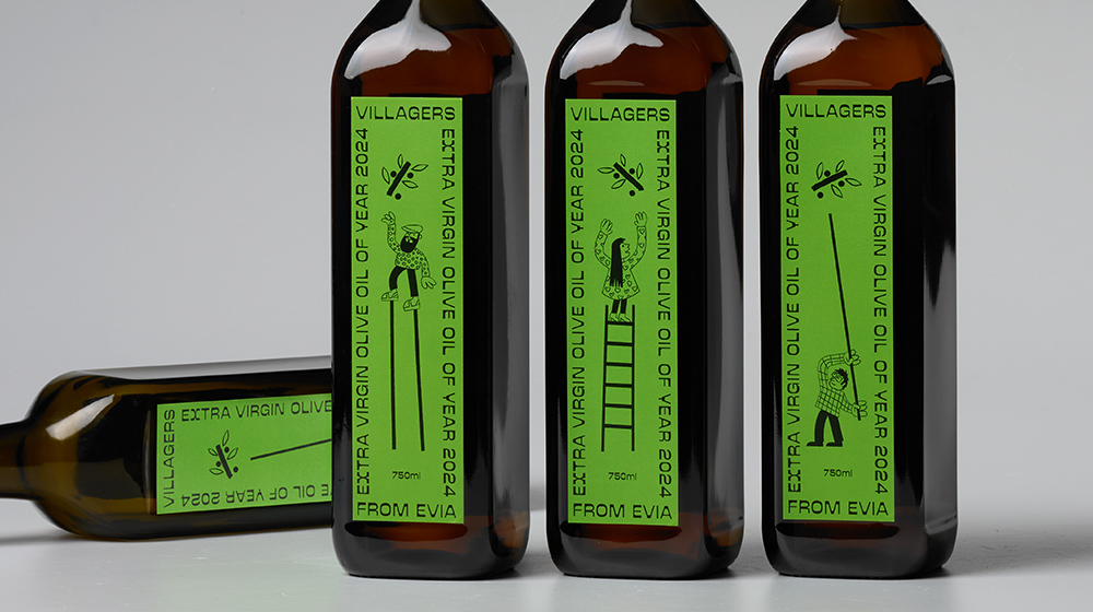
- Extra virgin olive oil
In a complex marketing strategy, illustrations can help position a product on the market and make it stand out. We used illustrations of villagers as the tool for building and reinforcing the brand's personality and values and together with the distinctive typography we conveyed the product's message like a brand's signature—distinct and recognisable.
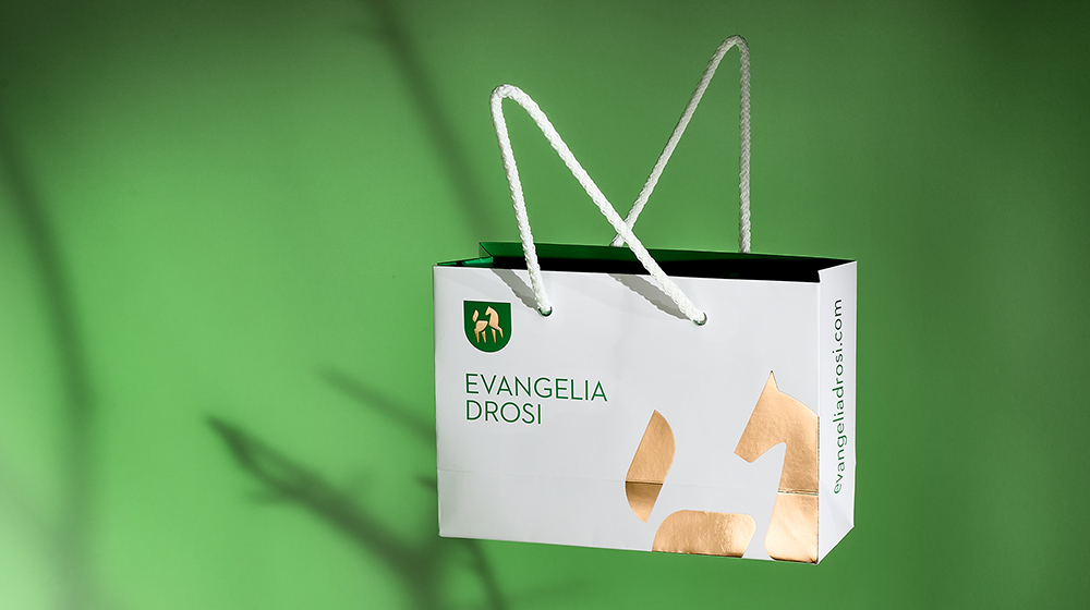
- Shoe company
Brand identity for Evangelia Drosi - handmade shoes and accessories company based in Athens.
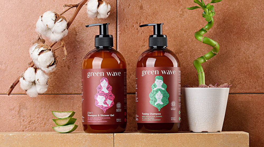
- Shampoo
Organic hair and body care series from bioLEON, certified by the ICEA organization with herbs and oils with properties suitable for the care, hydration and stimulation of hair and body.
"Green" from nature leaves and "wave" from water are combined to create the name of the product. The illustration depicts the leaf as a wave that showers the family with the natural ingredients of the product. A compelling brand story through packaging, focusing on emotional and intellectual engagement with customers.
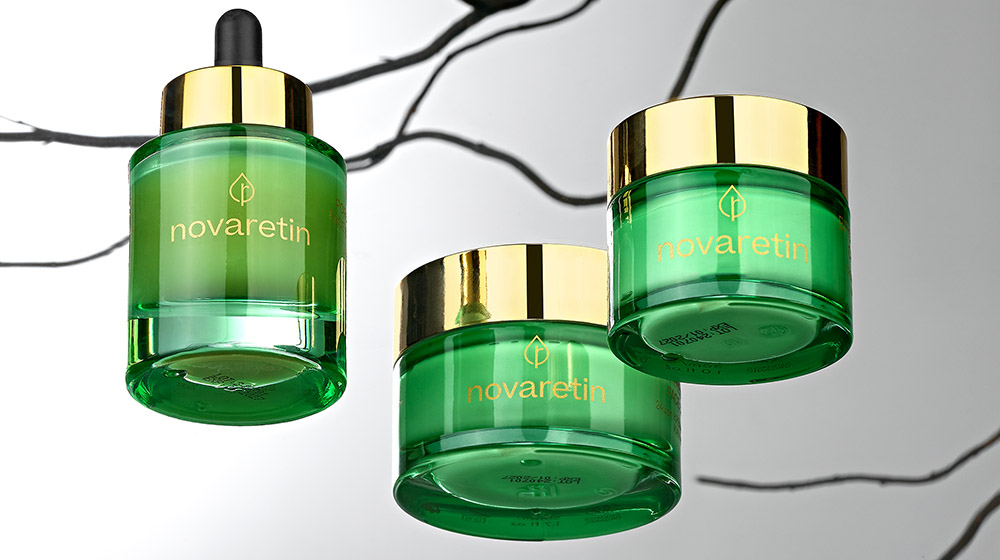
- Cosmetics packaging
The unique NovoRetin™ ingredient is based on mastic, an aromatic resin that comes from a tree that grows exclusively on the Greek island of Chios. NovoRetin™ serves as an ideal alternative to plant-based retinol, providing both powerful anti-aging effects and excellent benefits for acne-prone skin.
Clients seek designs that not only look good but also resonate emotionally with their target audience. Novaretin's brand and packaging is designed in such a way in order to connect with customer values and create a sense of luxury and comfort. Key words: resin, tree, organic, nature.
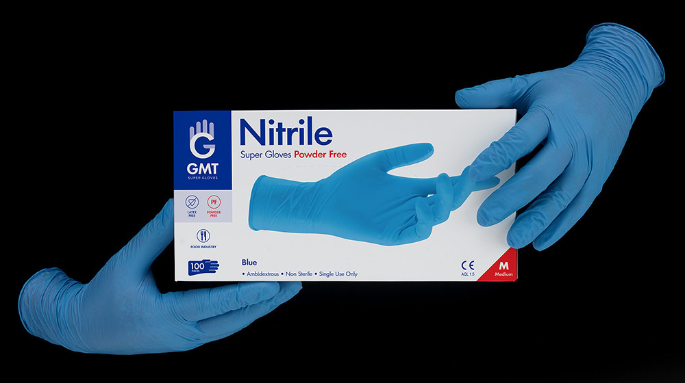
- Gloves packaging
Packaging design and rebranding for GMT gloves.
We were assigned by GMT super gloves for a holistic rebranding process. New Logo, Identity, and most of all, a new packaging system were designed and applied to 50 packages of different products, colors and sizes.
A group of top manufacturers of gloves in Asia created GMT to support the increasing needs of their clients all over the world in the most efficient way. Powder-free or powdered, GMT Super Gloves meet the strictest international standards and are suitable for a wide range of uses.
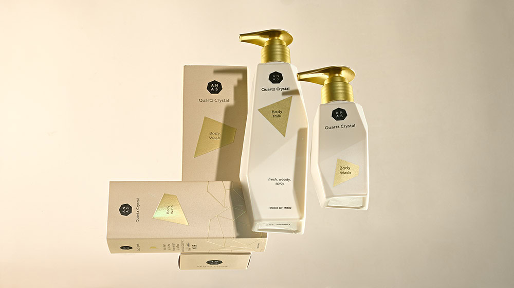
- Cosmetics packaging
ANAS from the Netherlands is the first patented line of cosmetics that uses the powerful properties of crystals by placing a whole piece of natural and refined Crystal Quartz in the heart of its volcanic water based formulas.
We designed a series of packages that have as key ingredient the "crystal", its shape and its characteristics. Our strategy was to invest in every way in the concept of crystal. The uneven shape has led us to think that the packaging itself should be like a crystal for easy recognition by the consumer. Crystal is made up of many small pieces so we visualize each product in the series as a crystalline shape and when all the products come together they create the ANAS logo.
- Cosmetics packaging
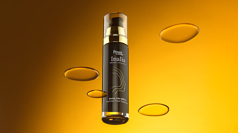
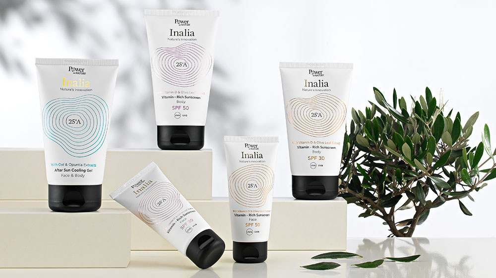
Powerhealth, one of the largest vitamin companies in Greece produces its first skincare series along with 25A Lab in Crete. Collecting herbal extracts and fruits from the land of the famous Crete island, Powerhealth uses “Nature’s Innovation” in the new products.
Our name proposal was “Inalia”, one of Aphrodite's names - the goddess of beauty - in ancient Greece. The topography and the altitude difference of the fertile soil of Crete were the inspiration for the creation of the series' visual mechanism. Concentrated shapes and curves demonstrate the altitude difference and also the way Nature's Innovation spreads to the skin. The interaction of science and nature is reflected in the bottle itself, where the outer rectangular part interacts with the inner cylindrical container. The internal cylinder spins when you rotate the lid …and the essence and the secrets of Nature's Innovation are released.
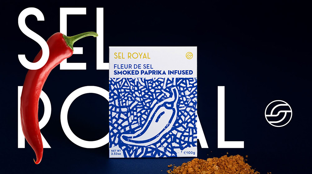
- Packaging
Branding for Sel Royal - Salt, natural infused with flavours. We designed an illustration system which defines and characterizes the graphic design of the packaging, giving a strong personality to the product and strengthening the corporate identity at the same time.
- Corporate identity
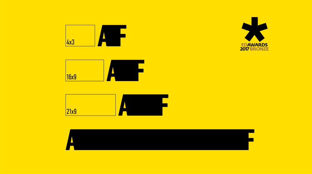
A “non static” Logotype for Angelis Movies LTD, the company of film and television productions based in Athens, Greece. The screen (logotype) acquires the proportions 4:3, 16:9, 21:9 that are used mainly in production formats and other times custom made proportions. Thus, the logo acquires flexibility and variety, and lengthens depending on the needs of each application, creating a dynamic identity and contemporary solutions for many branding applications.
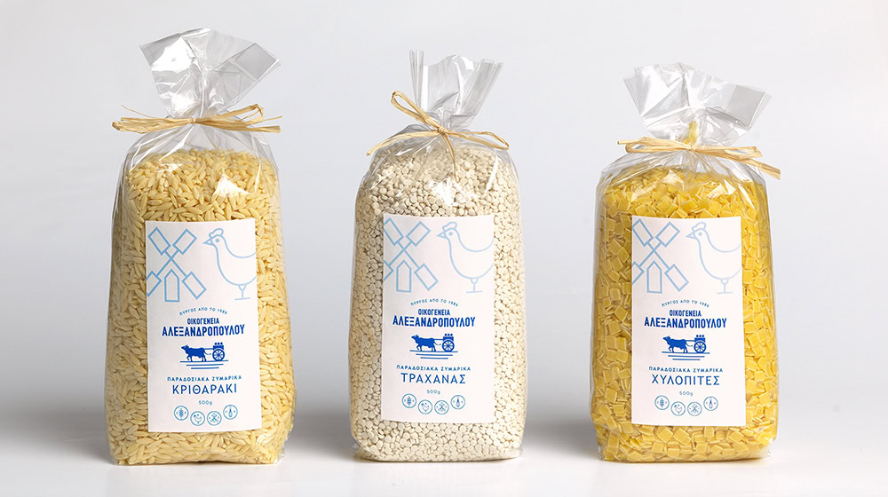
- Pasta packaging
The grandfather of the family traditionally drove the cow with the cart carrying milk to every house in Pyrgos Hleias (Greece). Pure daily milk from the family's cows and sheep. The cow cart becomes a figure of tradition and pure materials. The family's activities also extended to the production of eggs from the hens of the privately owned estate and soon the first pasta was produced with the unique recipe of the grandmother from Smyrna. Flour, milk, eggs and the passion of the Alexandropoulou Family are used in the grandmother's secret traditional recipe and since 1986 the pasta has been making its first appearance on the local market. Respecting tradition since 1986, the Alexandropoulou family has been producing authentic traditional pasta of high quality and nutritional value.
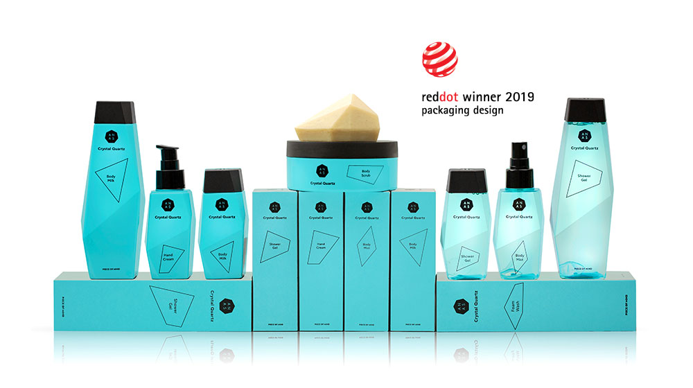
- Cosmetics packaging
ANAS from the Netherlands is the first patented line of cosmetics that uses the powerful properties of crystals by placing a whole piece of natural and refined Crystal Quartz in the heart of its volcanic water based formulas.
We designed a series of packages that have as key ingredient the "crystal", its shape and its characteristics. Our strategy was to invest in every way in the concept of crystal. The uneven shape has led us to think that the packaging itself should be like a crystal for easy recognition by the consumer. Crystal is made up of many small pieces so we visualize each product in the series as a crystalline shape and when all the products come together they create the ANAS logo. Also, we designed the packaging box in such a way that when someone opens it, the product information is gradually revealed. The chosen color, light blue-turquoise brings peace to the eye, as well as the positioning “peace of mind” becomes “piece of mind” in order for the branding to complete.
- Experimental project
Homer’s Blocks of Color is an exploration of different ways to chart a story visually. For this study, we referenced Homer’s two most iconic books, not only due to the plurality in characters and plot, but also due to the divine element in the narration.
The exploration led us to develop a visual system based on three basic guides.
For Guide 1 we capture the timeline of the novel – in this case, the days on which the narration of each book takes place. (y axis of the chart)
For Guide 2 we select characters who play a leading role in the development of the story, as well as things and incidents that affect them. After that we define one color block for each. (x axis of the chart)
For Guide 3 we place each character, thing or incident on the story’s timeline and match them in relevant combinations. (chart bars)
The outcome is a system that generates graphics based on the plot of each book. The system can generate visuals that can be applied on posters of theatrical plays, on covers of new books based on Homer’s work, on product labels and more. The method of this system is dynamic, making it applicable to other novels and books based on their unique content.
- Face & body cream packaging
We were assigned by Powerhealth, one of the largest vitamin companies in Greece, to design the package for its first suncare series. Our name proposal was “Inalia”, one of Aphrodite's names - the goddess of beauty - in ancient Greece. The topography and the altitude difference of the fertile soil of Crete were the inspiration for the creation of the series' visual mechanism. Concentrated shapes and curves demonstrate the altitude difference and also the way Nature's Innovation spreads to the skin, while white in combination with metallic colors enforces the scientific character of the products.
- Corporate identity
The new Logo for an orthopedic clinic that deals with the treatment of bones-joints diseases and injuries. TOC is made from the initial letters of the clinic Total Ortho Care. Dynamic and Organic combination of typography. Capturing the joints and the movement of the human’s body limbs. The logo's flexibility is depicting the recovered movement after surgery. Dynamic implementations in every piece of content of the brand identity. Memorable, Unique, Campaignable.
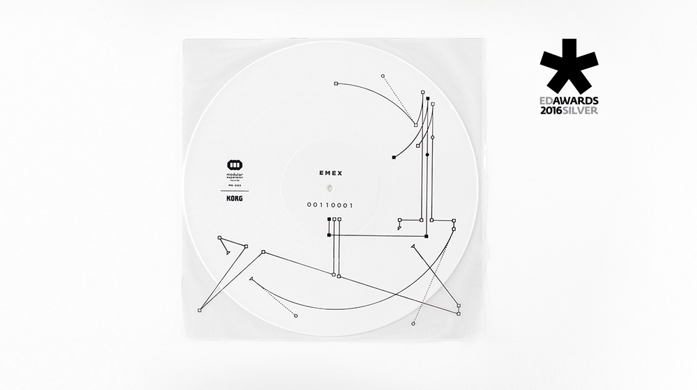
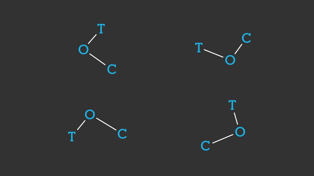
- Vinyl disc cover
Cover design and visual mechanism for Modular Expansion records. The vinyl record of EMEX is inspired by mathematics and digital electronics. The design, minimal and encoded, follows the conceptual fusion of dancefloor techno and atmospheric overtones. Designing a continues visual system that generates different graphics by following the above three rules: 1. The squares are the nodes and two ends create a straight line / 2.The triangles are the half parts of the node, so one continues the route of the other / 3. Circles are the levers that create the curves. Designing a continues visual system that generates different graphics.
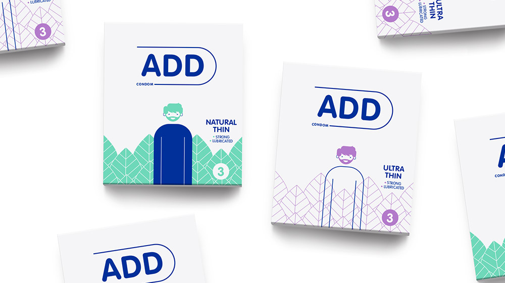
- Branding & packaging
To design a condom packaging, you have to be bold, speak to youthful codes, be up-to-date, but also differentiate yourself from the usual competition that has prevailed in Greece in recent decades.
So we chose white as the primary color and differentiated ourselves from the color codes of the competition. Then, we created an avatar hero, who wears a different outfit in each package and is the main visual mechanism. The outfit represents the type of condom contained in the package. Correspondingly, the condom name becomes part of the package and thus the word ADD is complemented each time by the positioning of each condom style (e.g. ADD Safe Sex, ADD Real Touch...). In this way, we created a system of word and image which can be developed further into subsequent types of condoms. For example, by changing the outfit to a jacket, we can talk about a thicker condom e.t.c.
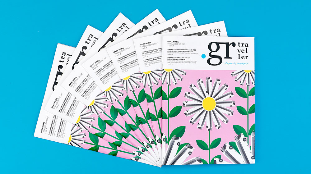
- Free press
Μagazine design for the first ever freepress magazine of intercity buses in Greece. Audience of magazine: travellers all around Greece who use the intercity buses. Content of magazine: depending on the season, the news and the destination of cities and islands.
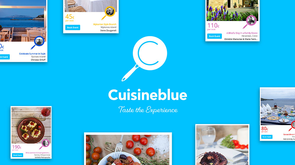
- Web platform
Cuisineblue is the booking platform for genuinely authentic dining and cultural experiences in Greece, offered by locals. For the launch of this platform, we were assigned to design the logo and visual identity of the brand. We came up with a simple but memorable idea. Α pan transformed into the symbol of searching: a magnifying glass and became blue, following the name of the brand (Cuisineblue) ang of course its Greek origins. You can see the platform here.
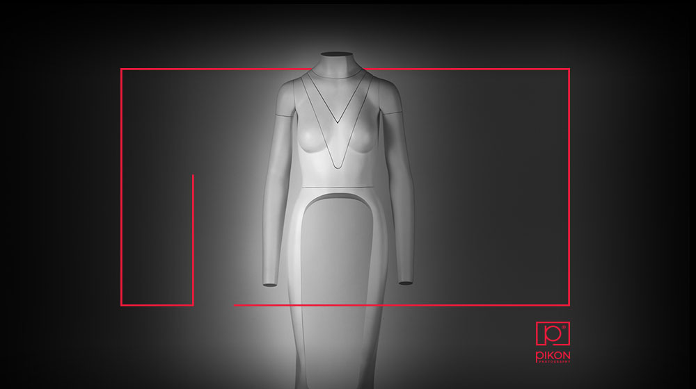
- Corporate identity
Logo design and corporate applications for Pikon Photography. The archigram of Pikon, becomes the frame and the camera itself. The feature of the logo is the key element in all the applications. Flexibility and storytelling comes out of a single mark.
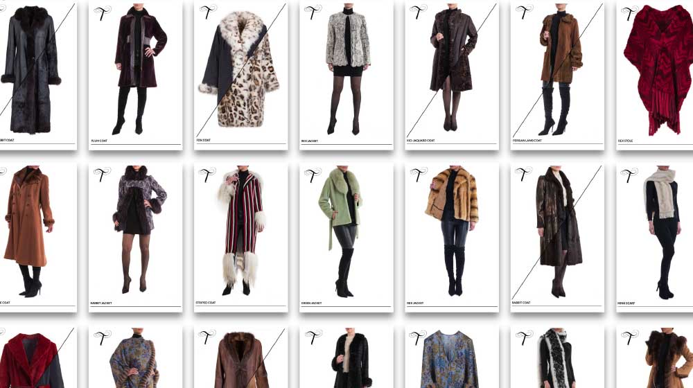
- Rebranding
For the historic fur house “Toutountzi” based in Athens, we were assigned to revamp their visual communication. Our main design vehicle was the letter T and we designed the logo and identity based on the brand’s 3 values: Classic, Unique, Handmade. The logo implemented in different formats and materials and became a very memorable asset for the company's visual communication.